


See All Photos
Interior Design Feb '08, "A Light Touch"
pages 170-179 by Dan Shaw
If you thought McMansions were a strictly suburban phenomenon, think again. Pseudo palaces are multiplying in New York as well, says Fox-Nahem Design's Joe Nahem—who finds them stacked one on top of the other in brand-new luxury apartment towers. But city real-estate developers, unlike their suburban counterparts, rarely give purchasers any options in hardware, finishes, or floor plans.
"That's why you see Dumpsters outside new buildings," Nahem says. "People rip everything out and start over."
Luckily, that didn't turn out to be the plight of a longtime Nahem client who'd signed a contract on a 3,800-square-foot floor-through that was being touted as "a Fabergé egg...a canary diamond"—but was actually still a work in progress. Nahem encouraged him and his wife to negotiate with the developer. "They wouldn't budge on the kitchen, but we got them to give us four and a half empty bathrooms," the designer says triumphantly.
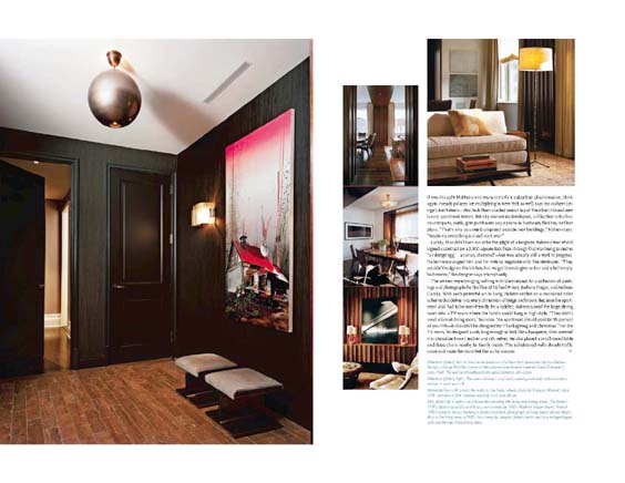
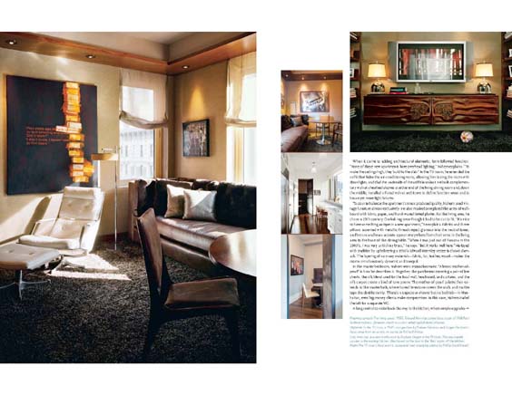
The owners were bringing nothing with them except for a collection of paintings and photographs by the likes of Richard Prince, Barbara Kruger, and Andreas Gursky. With such powerful art to hang, Nahem settled on a restrained color scheme that delves into every dimension of beige and brown. Because the apartment also had to be user-friendly for a toddler, Nahem turned the large dining room into a TV room where the family could hand in style. "They didn't need a formal dining room," he notes. "An apartment should work for 95 percent of your life—it shouldn't be designed for Thanksgiving and Christmas." For the TV room, he designed a sofa long enough to look like a banquette, then covered it in chocolate-brown leather and silk velvet. He also placed a small round table and three chairs nearby for family meals. The upholstered walls absorb traffic noise and make the room feel like a chic cocoon.
When it came to adding architectural elements, form followed function. "None of these new apartments have overhead lighting," Nahem explains. "To make the ceilings high, they build to the slab." In the living room, he extended the soffit that hides the air-conditioning vents, allowing him to ring the room with downlights, and clad the underside of the soffit in walnut. He built complementary walnut-sheathed alcoves at either end of the living-dining room and, down the middle, installed a fluted walnut architrave to define function area and to house yet more light fixtures.
To counterbalance the apartment's mass-produced quality, Nahem used vintage furniture almost exclusively. He also masked or replaced the acres of wall-board with fabric, paper, and hand-waxed tinted plaster. For the living area, he chose a 19th-century Oushak rug even though it had to be cut to fit. "It's nice to have something antique in a new apartment," he explains. Fabrics and throw pillows accented with metallic threads inject glamour into the neutral tones, and bronze and brass accents appear everywhere from chair arms in the living area to the base of the dining table. "When I was just out of Parsons in the 1980's, I was very anti shiny brass," he says. "But it works well here." He toyed with tradition by upholstering a 1950's Edward Wormley settee in classic damask. The layering of so many materials—fabric, fur, leather, wood—makes the rooms simultaneously dynamic and tranquil.
In the master bedroom, Nahem went monochromatic. "Almost mother-of -pearl" is how he describes it. Together, the parchment covering a pair of low chests, the silk blend used for the focal wall, headboard, and curtains, and the silk carpet create a kind of tone poem. The mother-of-pearl palette then extends to the master bath, where honed limestone covers the walls and marble tops the double vanity. There's a capacious shower but no bathtub—in Manhattan, even big-money clients make compromises. In this case, Nahem traded the tub for a separate WC.
A long central corridor leads the way to the kitchen, where simple upgrades personalize the standard-issue fare. To replace the original granite counter, for example, Nahem found an extraordinary gray-and-white marble that's more striped than veined. He also inserted wavy glass in the doors on the upper cabinets, blurring cereal boxes and soup cans into abstract art.
One of the few art-free spaces is the powder room—which dazzles with shimmering penny-round tiles of alloy-brushed stainless steel, framed by borders of snow-white Corian and illuminated by a pair of Italian frosted-glass sconces, circa 1960. Checking out your reflection in a mirror of the same vintage, you'd swear you were in an exclusive nightclub or boutique hotel, not a McMansion in the sky.